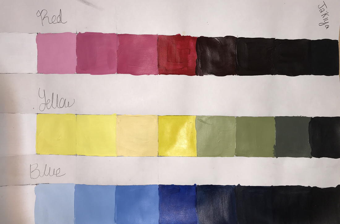
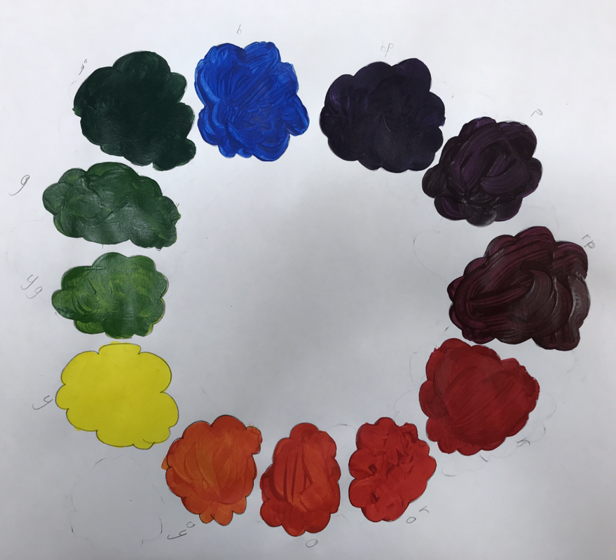
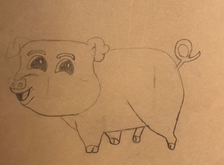
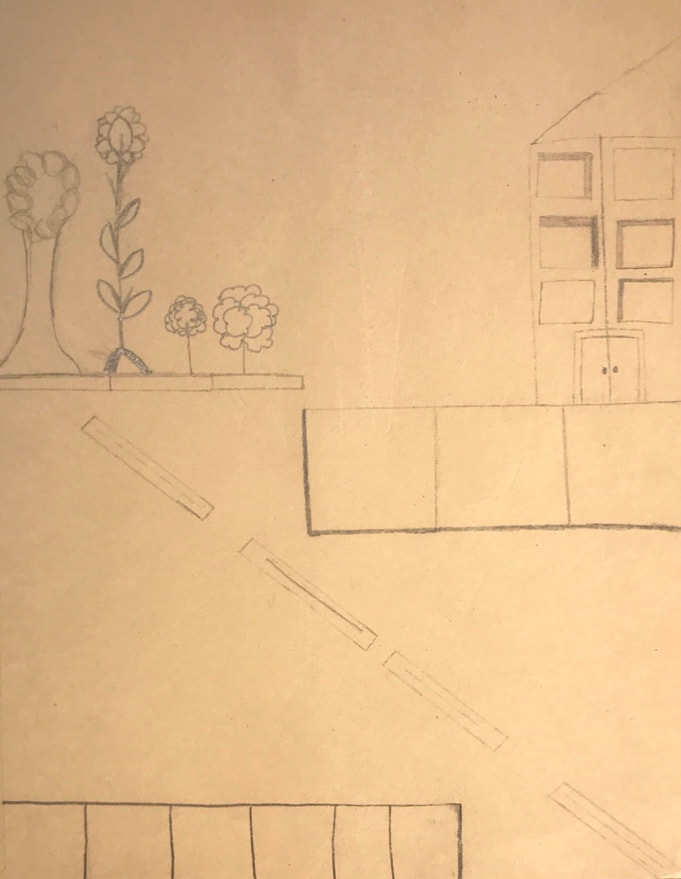
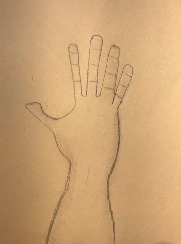
These drawings are from the first week of class. For these drawings we had to see what we know already and draw it.
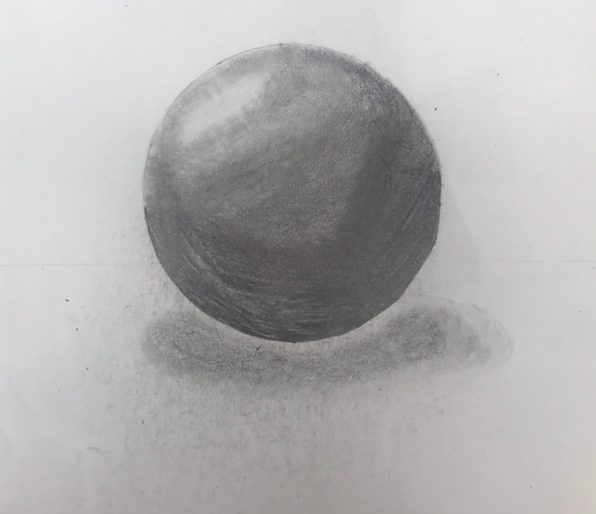
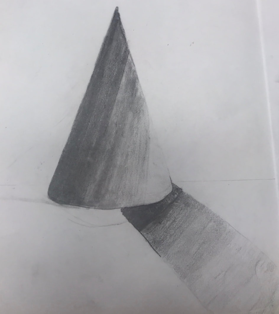
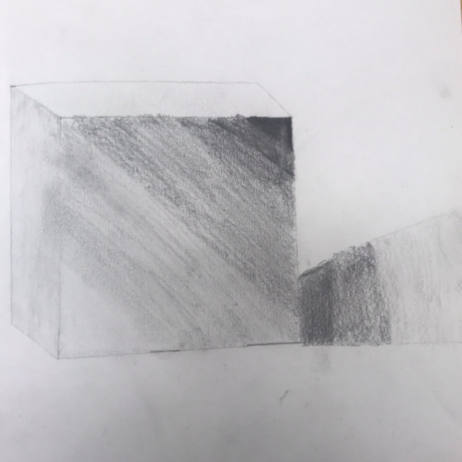
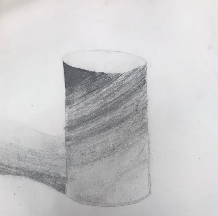
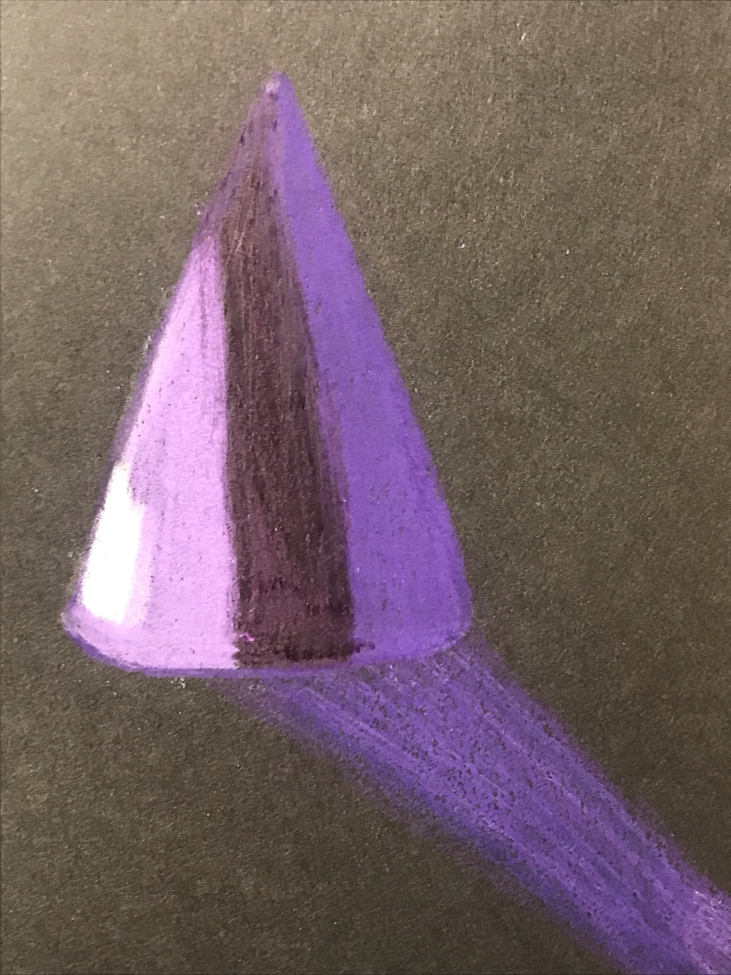
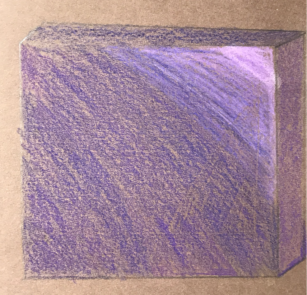
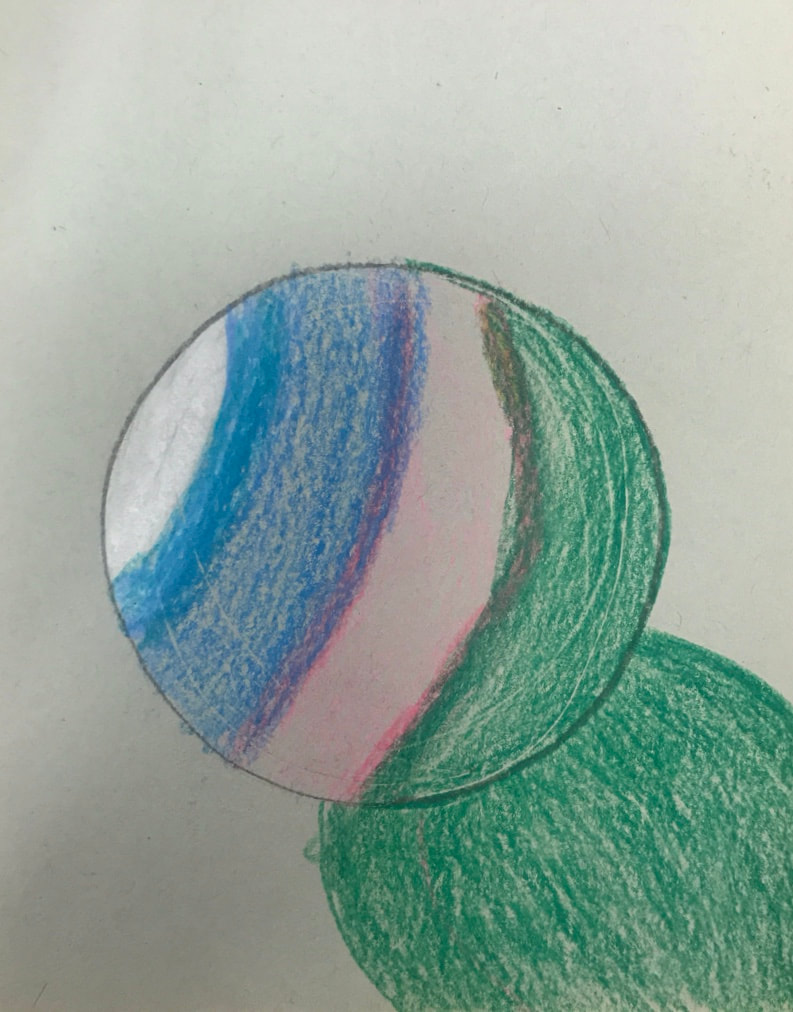
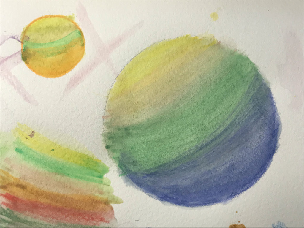
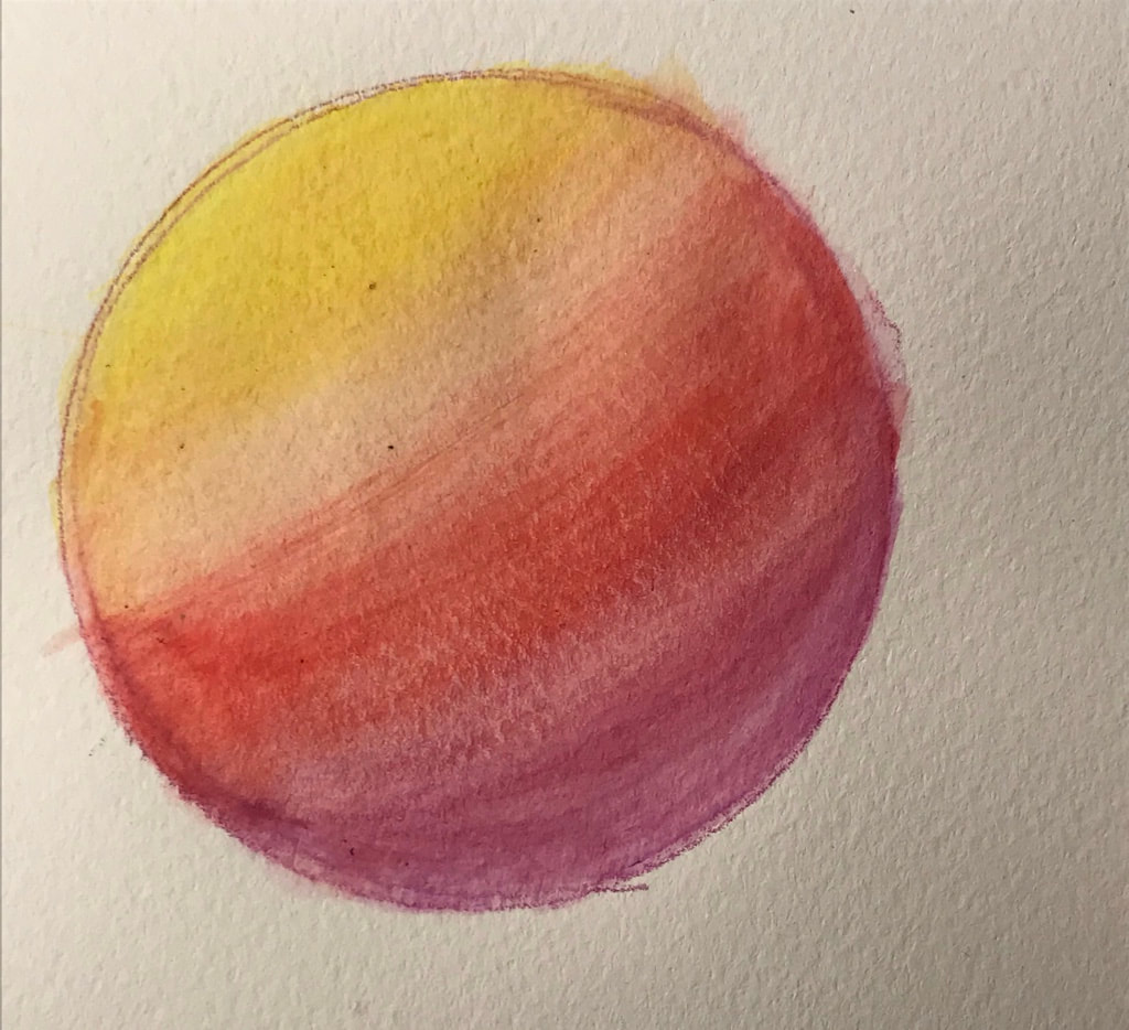
The next couple of drawings are of the 4 shape drawings with shading. For these drawings we were basically showing the teacher what we already know from Art I. The first one being a sphere, the seconds one is a cone, the third one is a cube, and the last one is a cylinder.
Still Life Drawings Questions
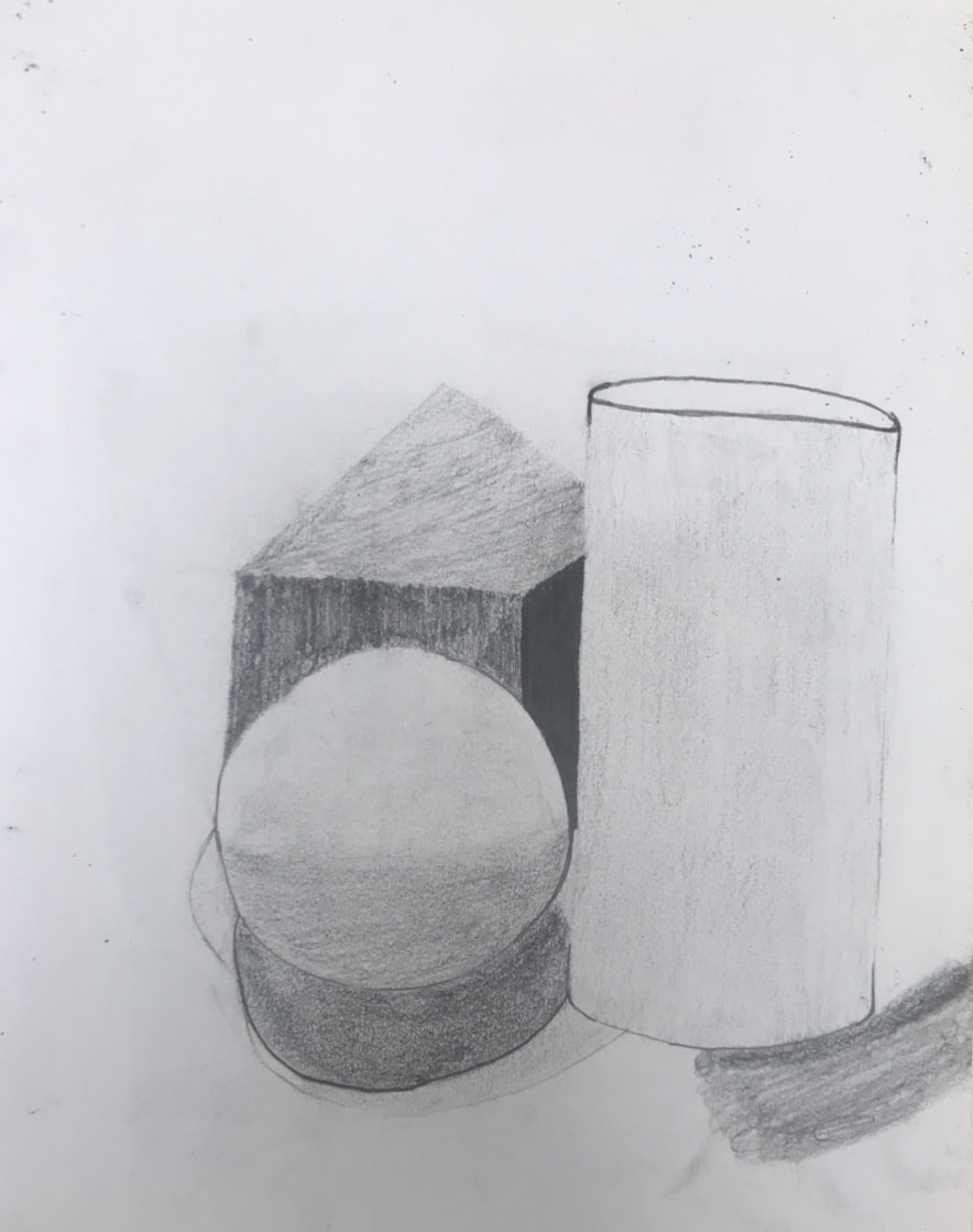
The next couple of pictures are of the still life drawing we worked on. The first two are progress pictures and the last one is the final one.
1. I arranged my composition randomly so there is really no pattern. The element I used in my drawing was value. This can be shown through the darkness or lightness of the drawing which could also show a little bit of form. The principle shown in my drawing is variety because there’s different shapes. I also think movement is somewhat in my drawing because everything sort of flows together. The composition is kind of successful but it could look better.
2. I did not use a wide range of values which I should have done. The front has darker shadows and the back has much lighter shadows. I would say it’s evident in the background and the shadows compared to the front.
3. My previous experience with using pencils helped me with this drawing because helped me shade things correctly.
4. The lighter the value the less pressure I used on it.
5. The textures in the still life are smooth but some are kind of rough. I achieved this by shading how I did.
6. If I could recreate my pieces, I would go a little slower on it and I wouldn’t make it as dark as I did.
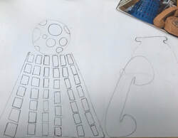
Compositional Sketches of the Still Life drawing
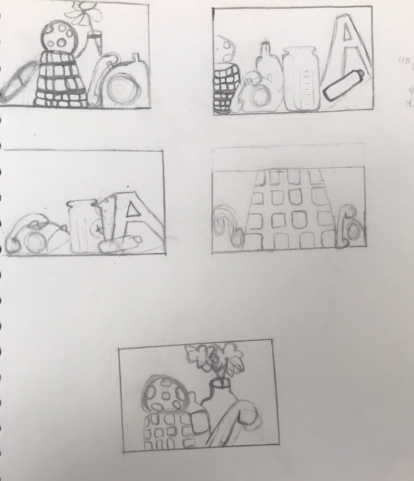
The pictures on the left are Compositional sketches of the Still-Life drawing. In my opinion, the still-life sketches were kind of hard at first because I was confused on where to start. Then, i began to get the hang of things.
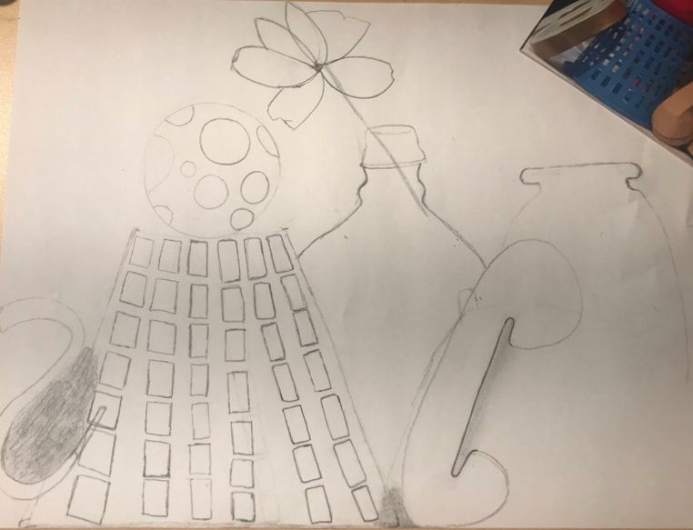
Still Life Progress Drawings
On the left is my progress pictures of the Still-life drawing. My fear of drawing the still-life was that I would mess up and have to start over.
Final Still-Life Drawing
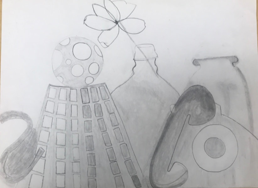
Still Life Pencil and Colored Pencil Drawing
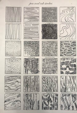
Pen and Ink Unit Techniques
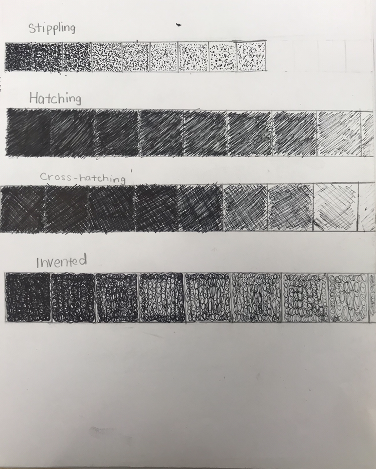
The first thing we did for the Pen and Ink unit was the techniques you use, the one at the top is called Stippling. Stippling is a tedious process of small dots. The one below is Hatching. Hatching is just straight lines in different densities to create shadows. The 2nd to last one is Cross-hatching which is hatching and then perpendicular lines hatching across it. Then 'Invented', this one you can make up but it has to be consistent.
Pen and Ink practice worksheets
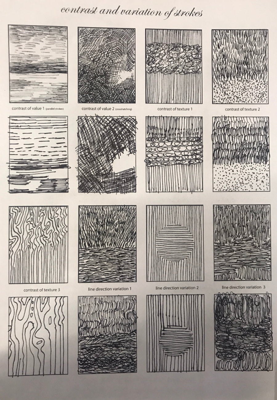
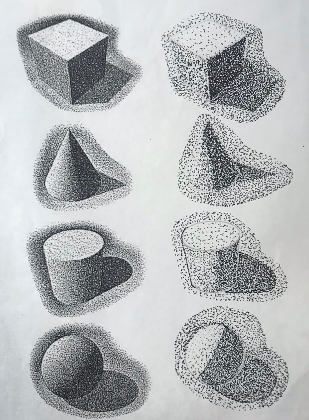
The 3 above pictures are some pen and ink practice with different forms. This assignment wasn't really that hard for me but it could look better.
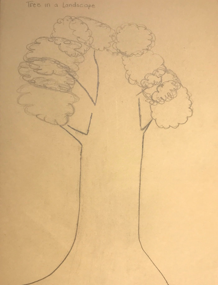
Landscape Patterns Drawing
For this assignment, we had to look at our 100 tiles and decide which patterns we wanted to use. I think this assignment was easy and looks pretty neat.
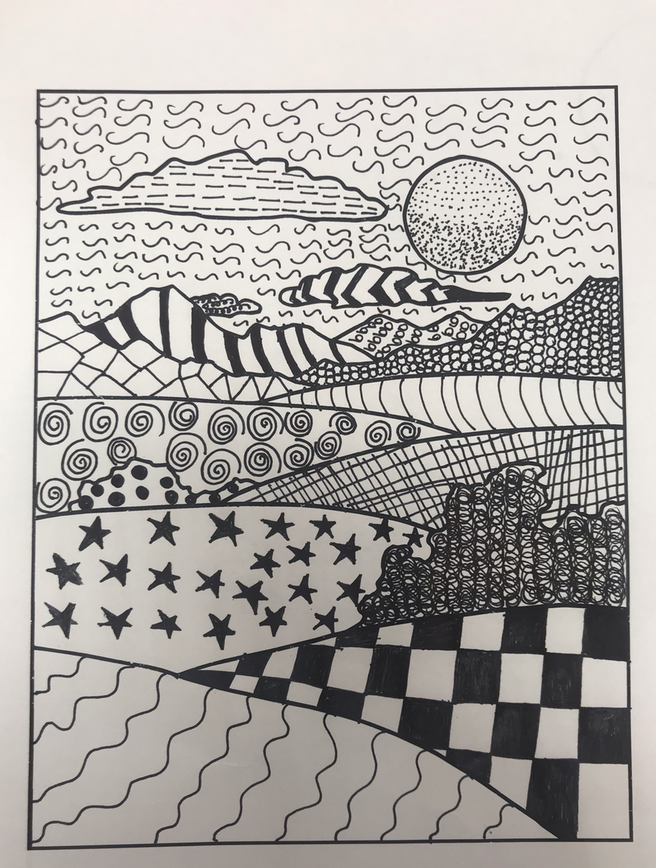
Landscape Patterns Drawing
100 tiles
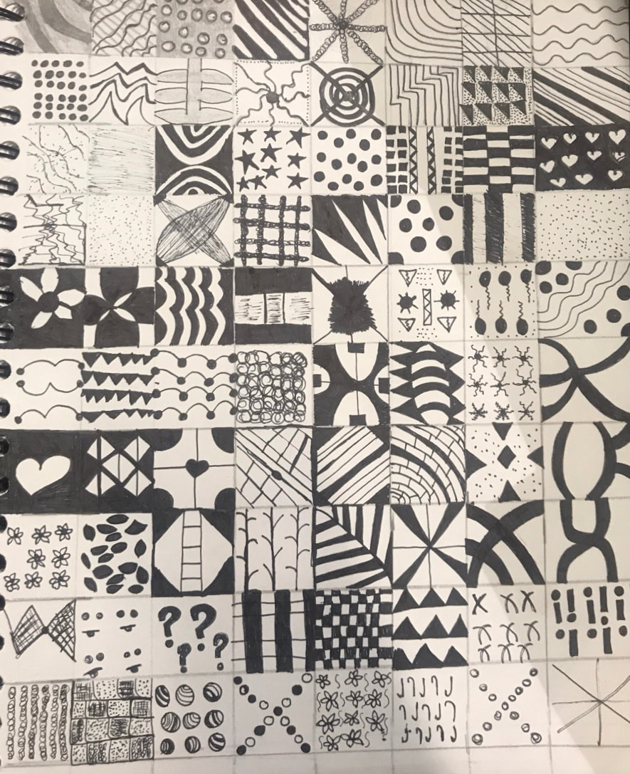
For this assignment, we had to create 100 patterns using pen. To start this assignment I started using pencil to make sure I didn't make any mistakes, then I went back to them and begin using pen. Overall, I think this assignment looks good mostly because of the variety of patterns that I could think of.
Pen Project
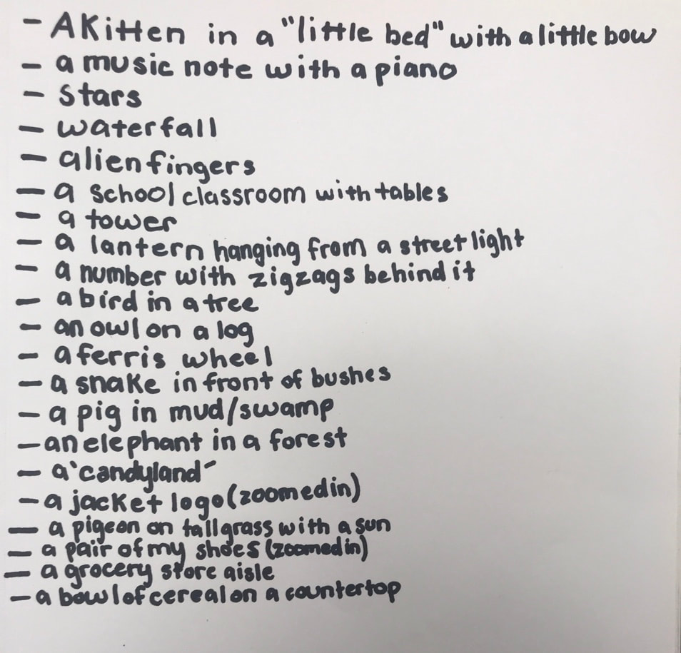
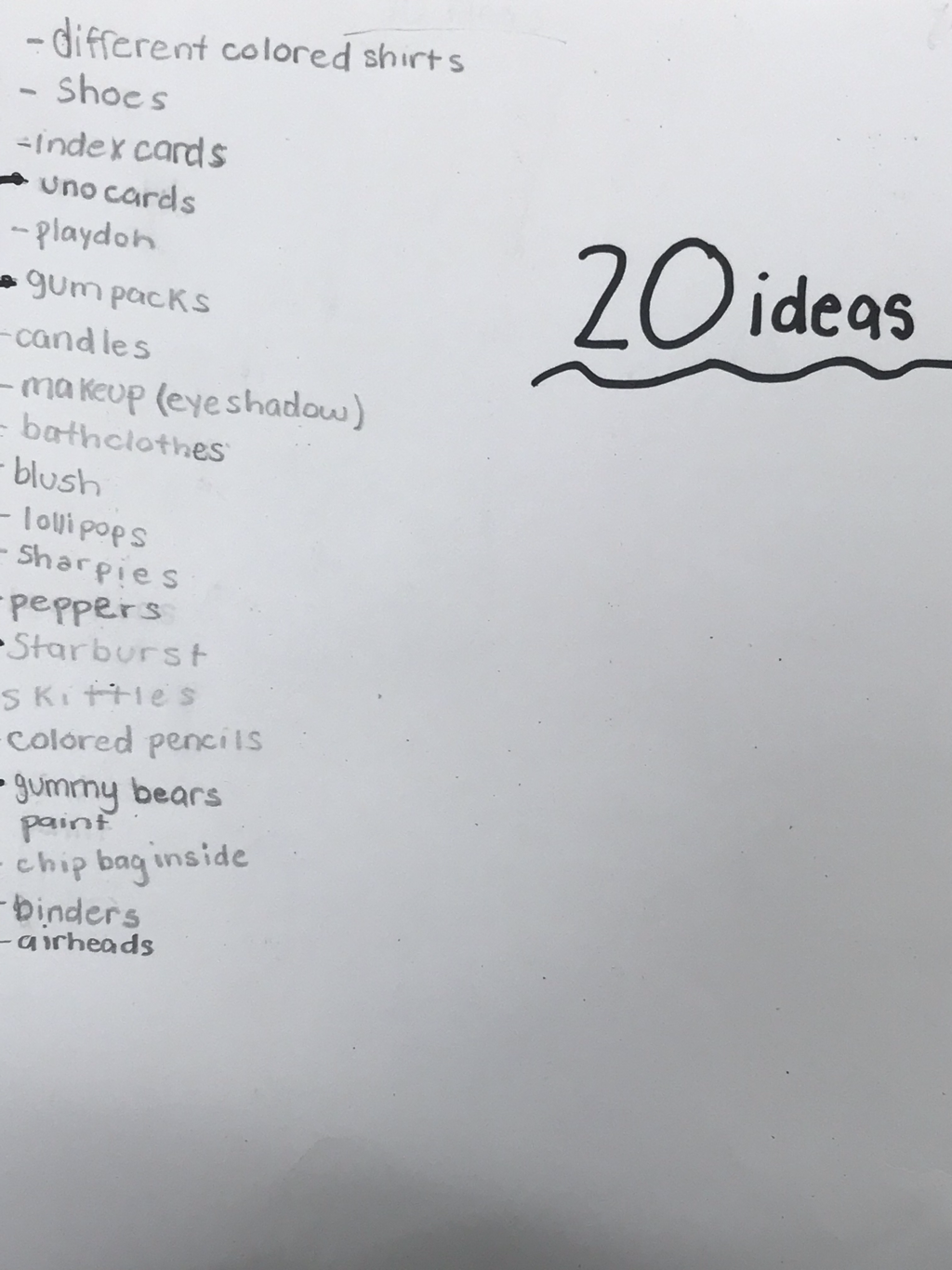
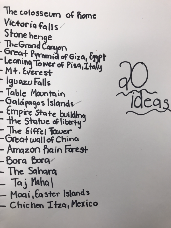
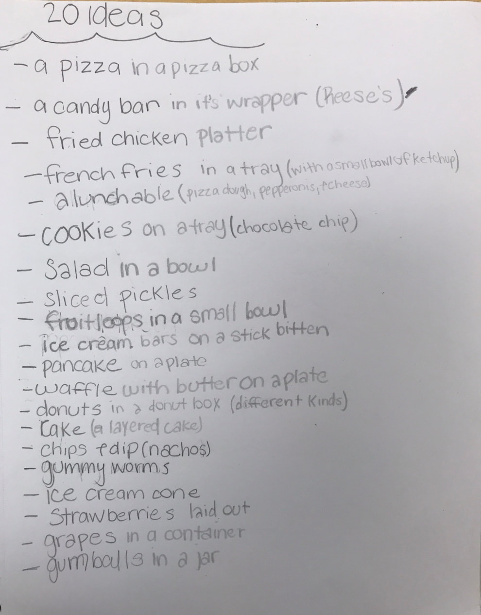
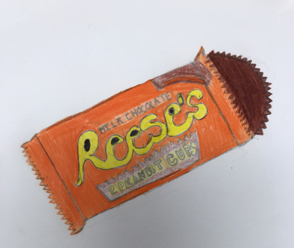
20 Ideas Brainstormed
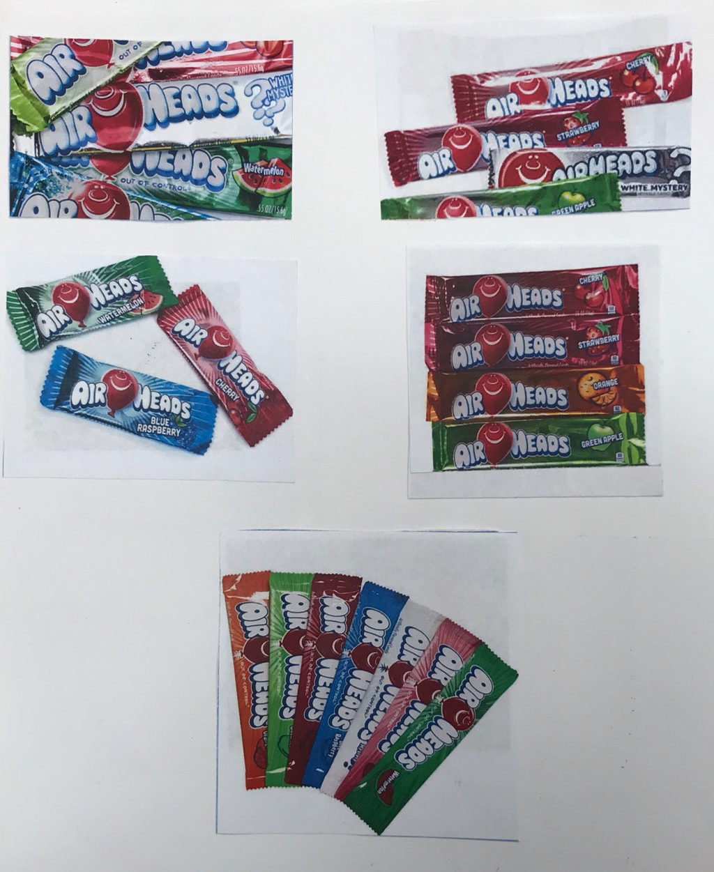
The pictures we had to take of our best 2 ideas
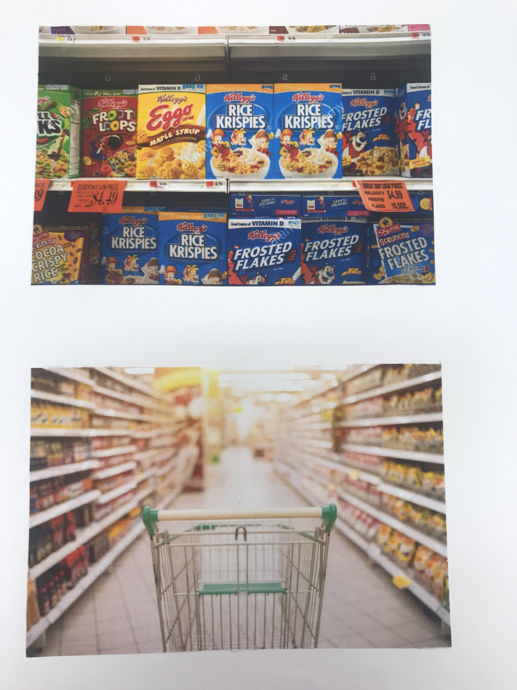
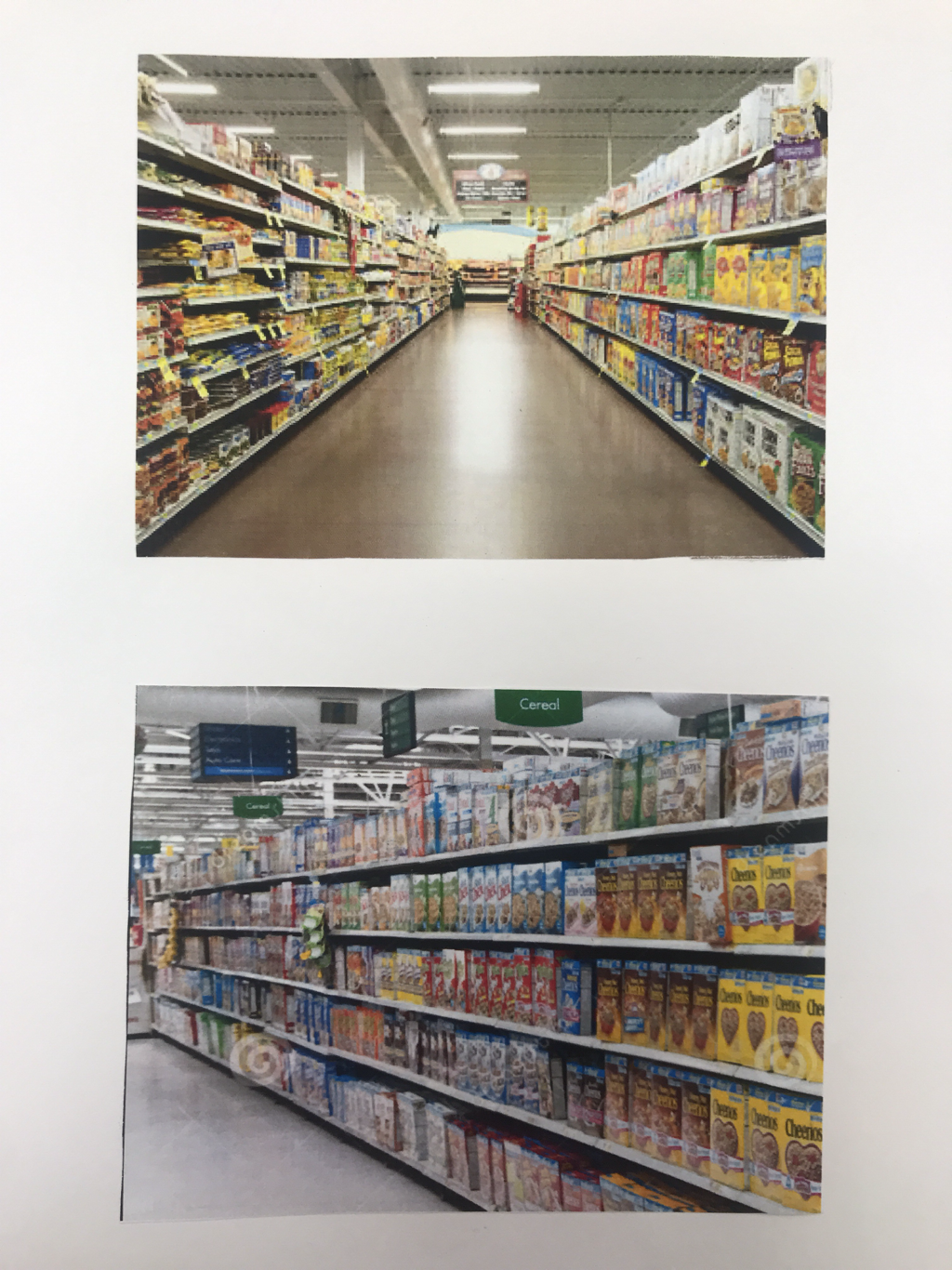
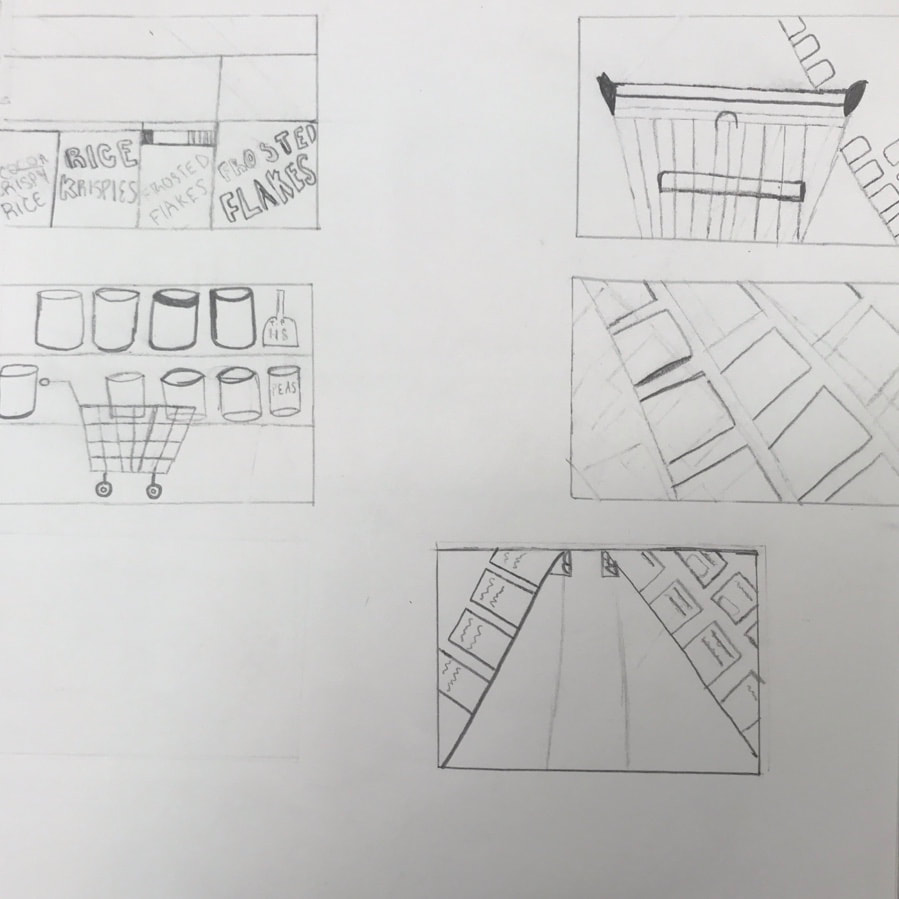
The first one: A Grocery Aisle
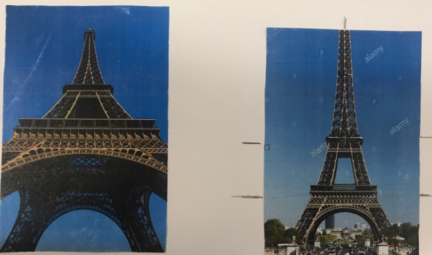
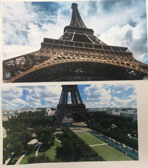
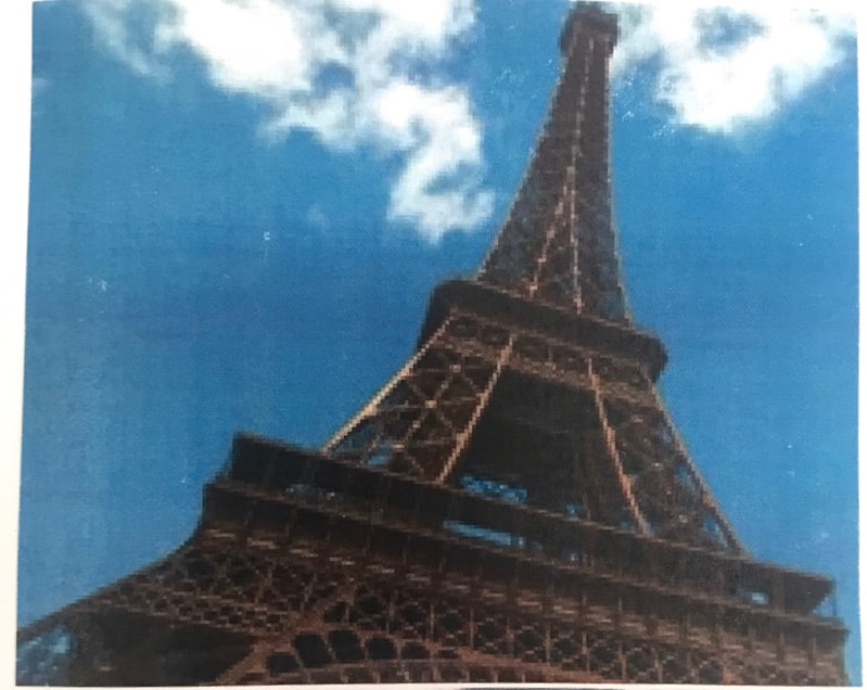
The second one: The Eiffel Tower
The first one: A Grocery Aisle
The second one: The Eiffel Tower
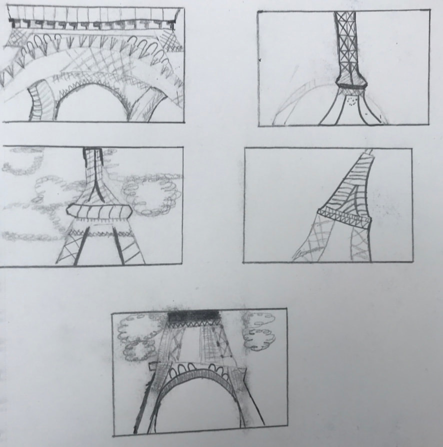
The Eiffel Tower
Compositional Sketches of the Grocery Store Aisle
Compositional Sketches of The Eiffel Tower
Prisma, Pastel, and WC prisma
|
|
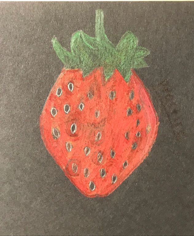
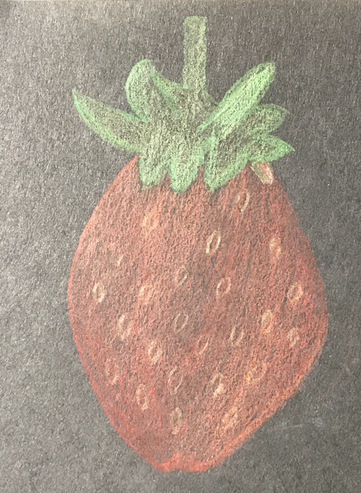
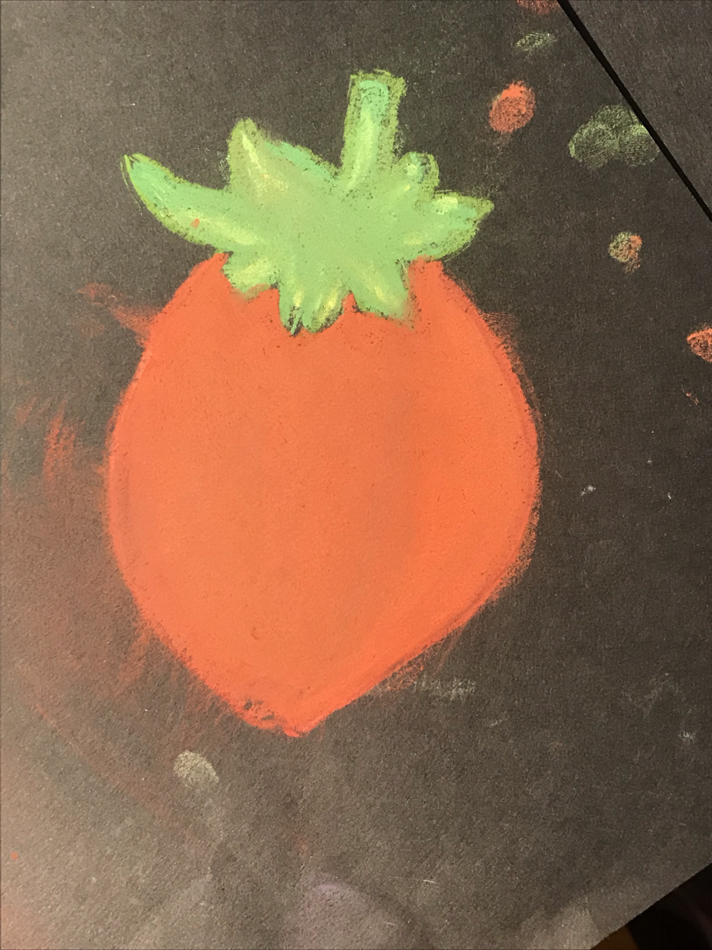
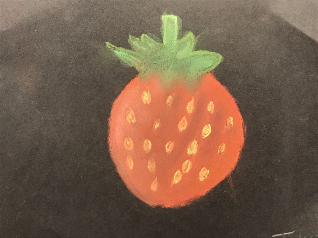
For this assignment, we had to use prismacolor pencils, pastels, and watercolor prisma pencils to draw a fruit of our choice. I think these tasks were easy and I liked using more than just red and green.
Colored Pencils/Pastels/Watercolor Pencils Unit
Coming up with 20 ideas for grouping of objects with color
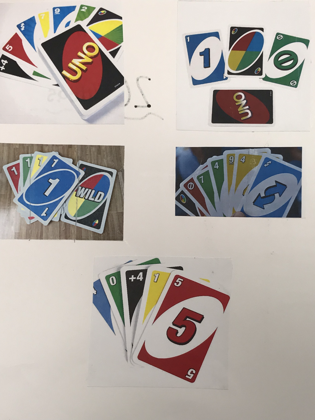
2 ideas that I decided from my 20 ideas
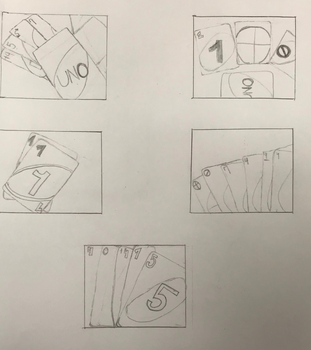
Uno Cards with its Compositional Sketches
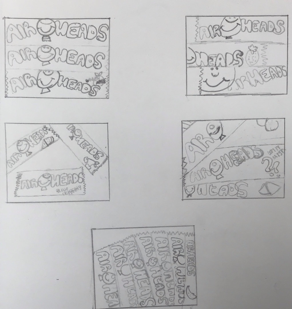
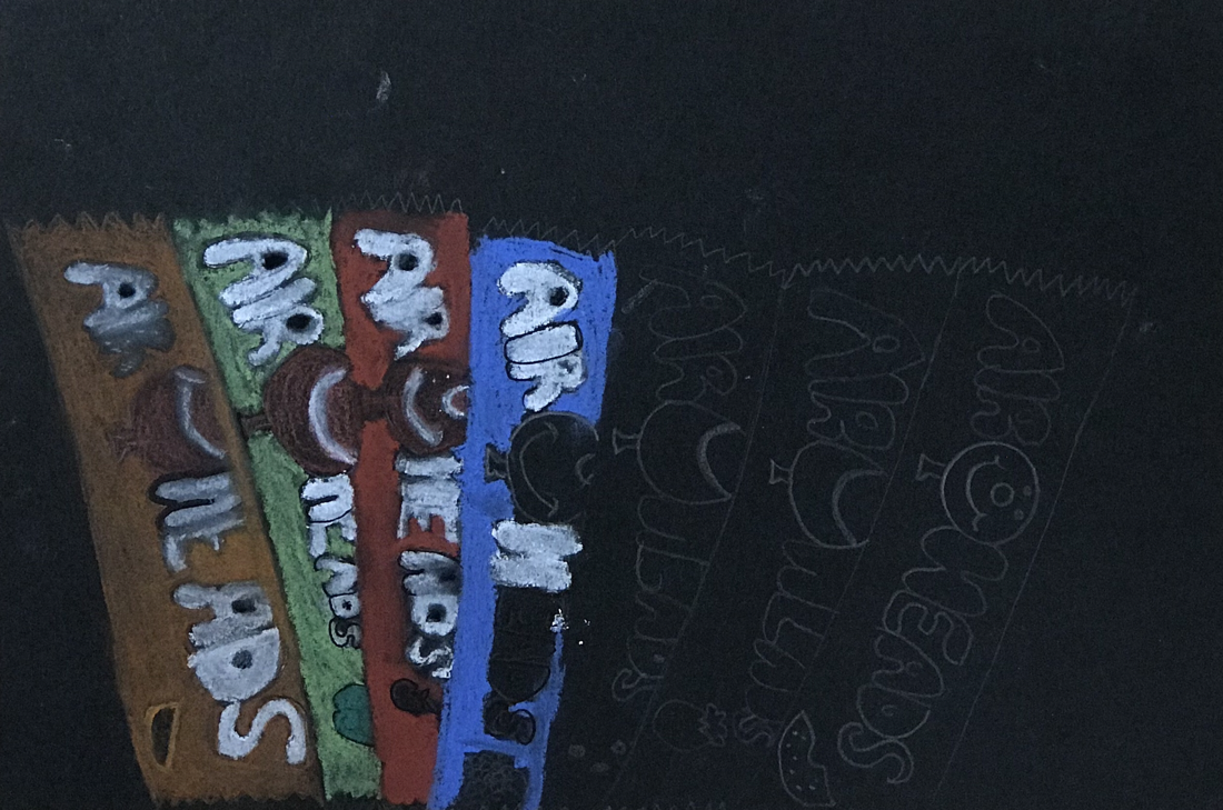
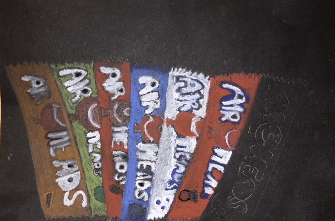
Airheads with its Compositional Sketches
Critique Questions
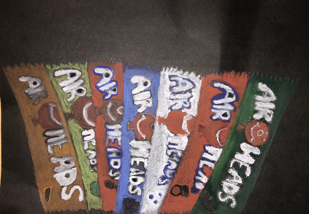
1. My composition of the airheads had a somewhat even balance. I used repeats of colors such as the red and white on each of them.
2. I added dimension by adding a dark value. I also used prisma color and pastels to make it look realistic. For my final drawing, I don't think the dimension was that important because it doesn't make it look any different.
3. By using exaggerated colors, I was able to have my drawing look very realistic. I realized that using several colors and not just one brings the whole drawing together.
4. The craftsmanship of my final drawing was overall pretty good. Before even starting, I made sure to plan out how I wanted everything to look and I think the overall quality was somewhat good as well.
5. Yes I was able to achieve depth by showing foreground, middle ground, and background. I showed foreground by adding light value/colors to the drawing. I believe I showed background by keeping the dark value.
6. I enjoyed using the pastels because they weren't as hard as I thought it would be. I did have some struggles throughout the drawing because it was kind of hard to keep the colors to themselves.
Final Drawing of this Unit ~ Airheads
Progress Pictures (3)
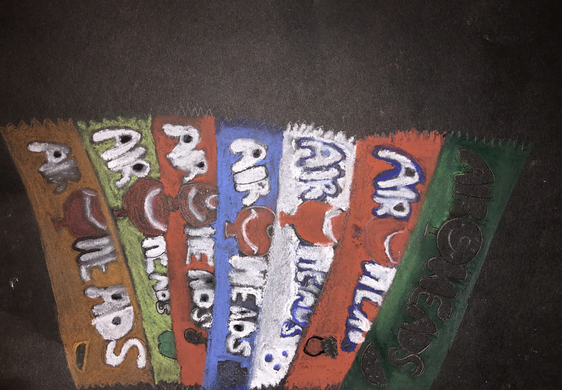
Final Drawing
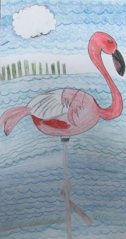
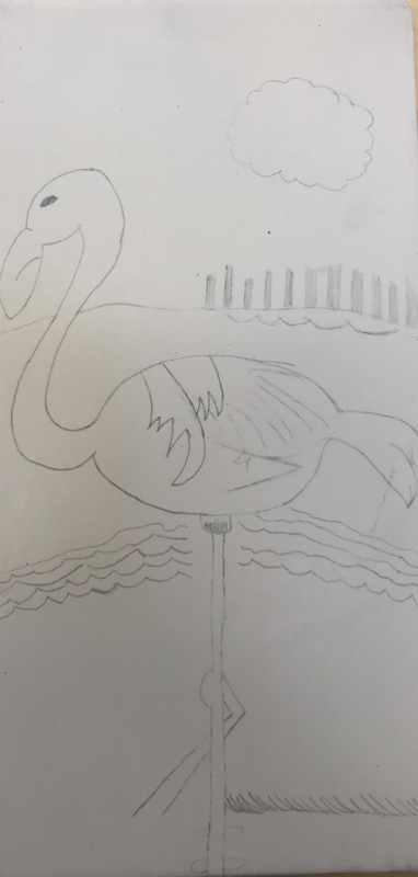
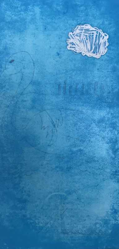
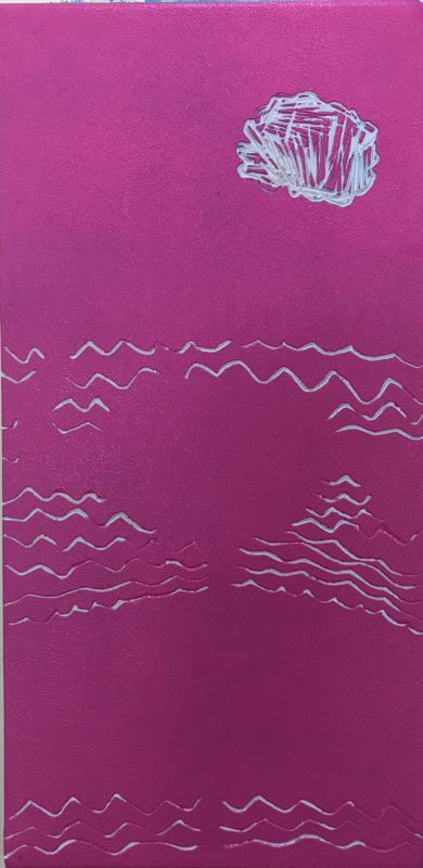
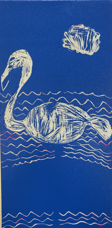
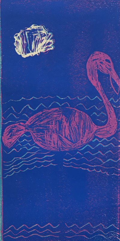
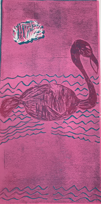
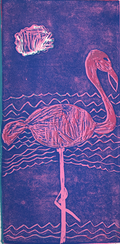
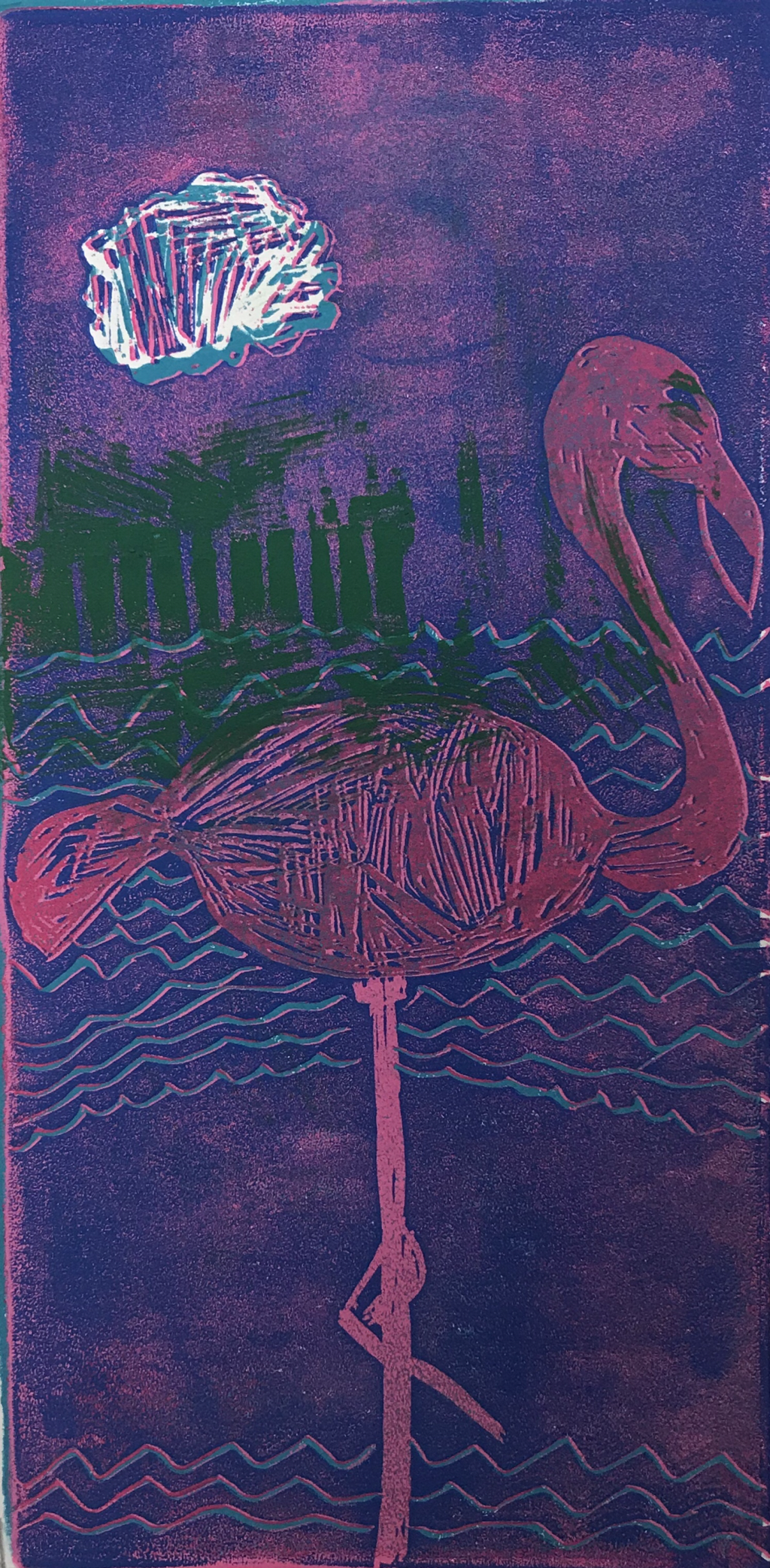
Print-Making Project
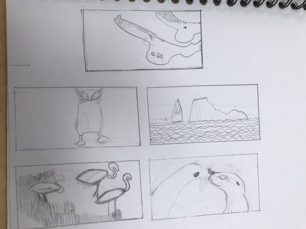
For this project, I decided I wanted to the animals on the Galapagos Islands
The Critique questions:
1. Describe the craftsmanship of your prints.
I feel as though the craftsmanship of my prints were good somewhat. I think overall, I could have done a lot better.
2. How did you use texture, color harmony and balance to define your choice of subject?
I think the texture of my project allowed it to look the way it looks at the end, but it's not really how I wanted them to look. I think the color harmony adds a lot of detail to the final.
3. If you could recreate your pieces what would you do differently to enhance your final outcome?
If I could recreate my piece, I would try to be more careful with how I place it on the paper so it won't look so bad.
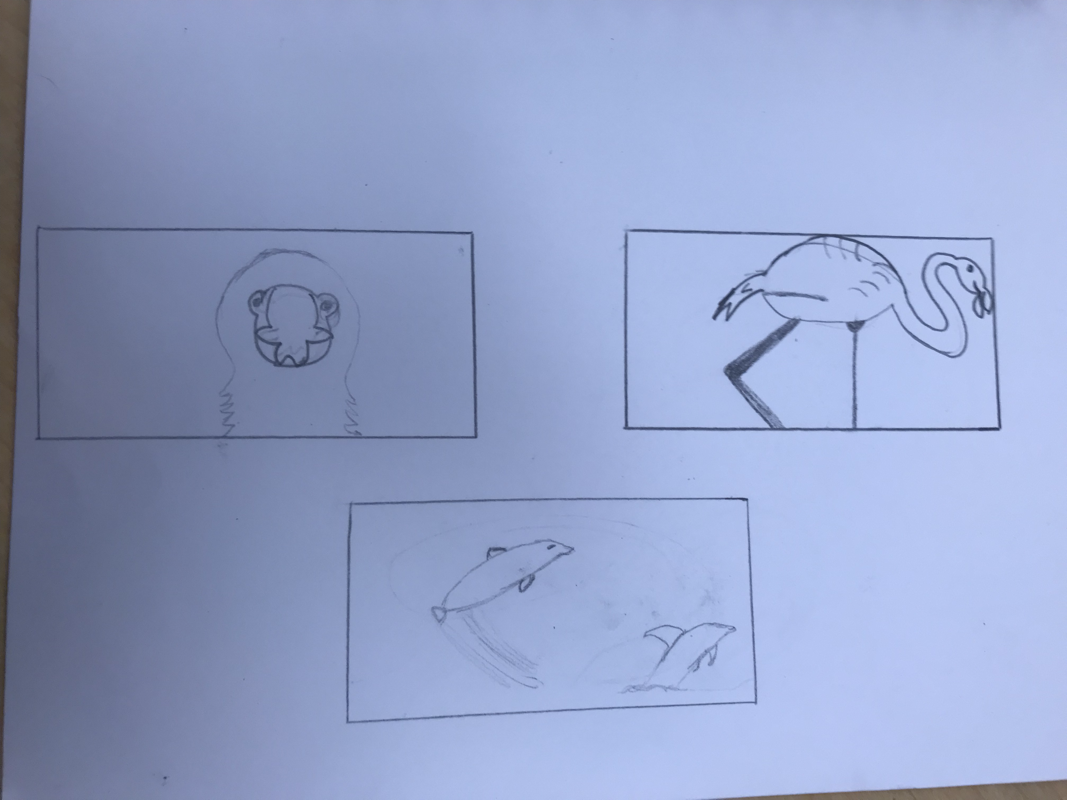
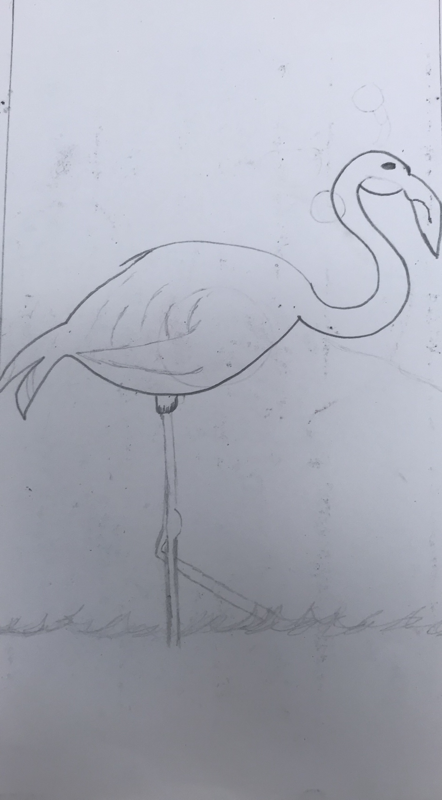
The first & third picture are of my compositional sketches. The middle picture is of my 20 ideas for this assignment.
The next couple of pictures are my in-progress pictures which are just a combination of what went on throughout the project
Final:
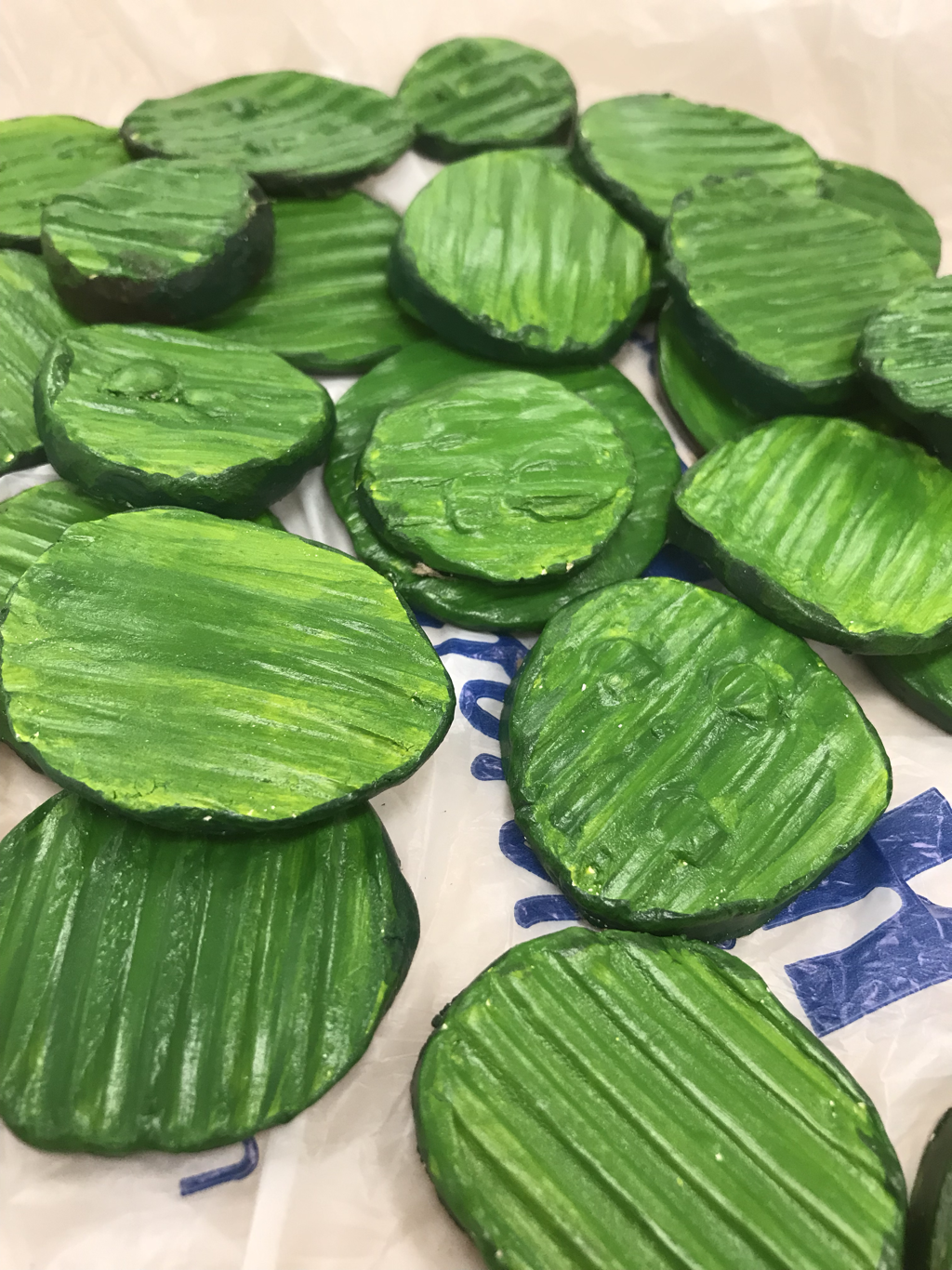
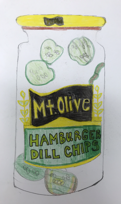
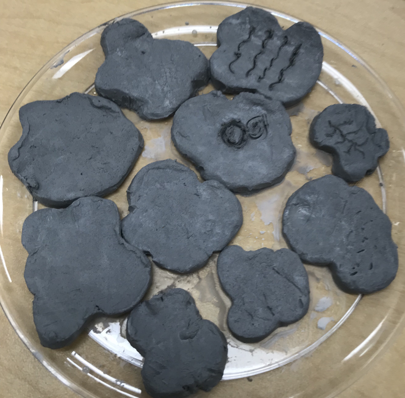
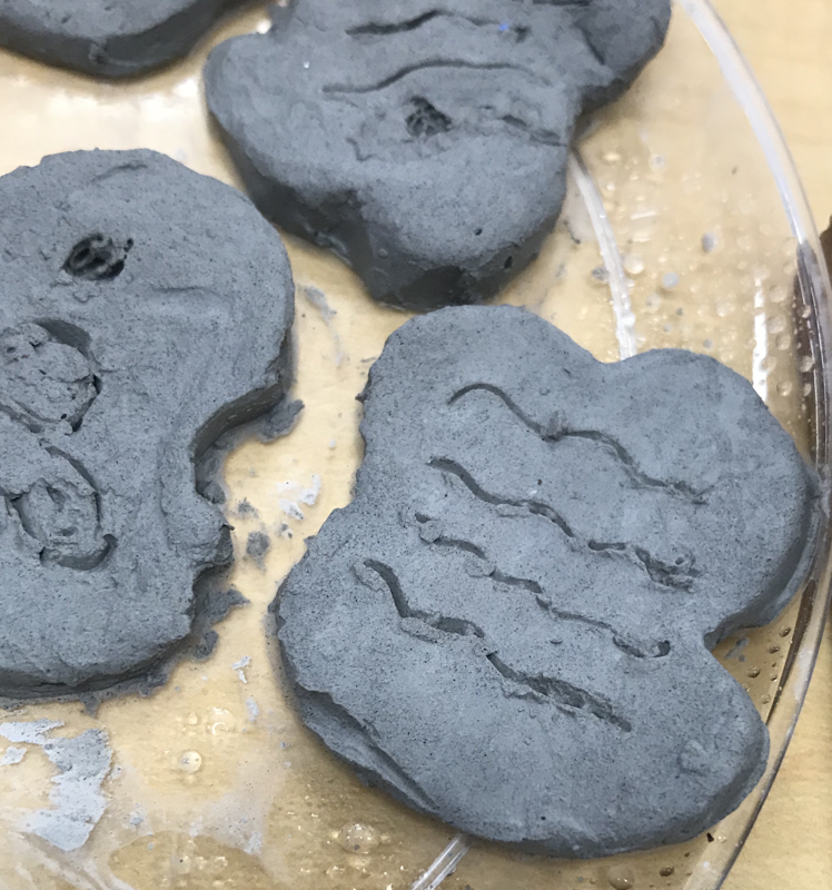
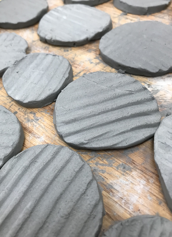
Clay Food Project
20 Ideas
Clay Food Reference Pictures
| food_clay_project.pdf |
Clay Food Colored Drawings
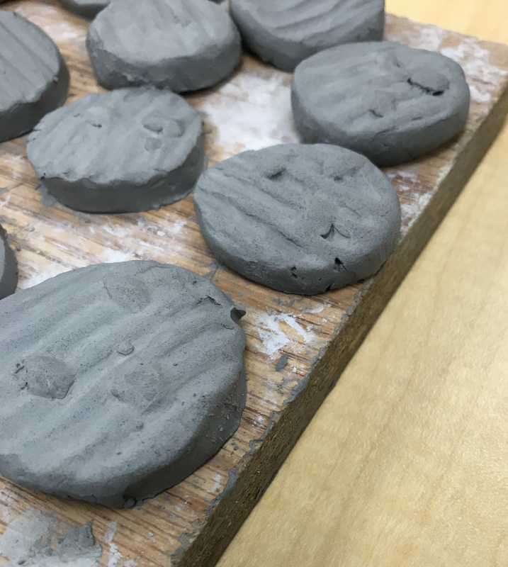
Clay Food Progress pictures
Final Clay Piece